
Newpaper : We Make It Better
“As a retiree, loneliness can feel overwhelming. New technology often feels intimidating, and I wish it was more familiar and approachable, something that could help me connect with people my own age.”
Project based in Bovisa, Milan for retired Italian seniors over the age of 60. Newpaper helps seniors connect with others while keeping them entertained.
The process
The Problem
Retired people over 60 often feel lonely and secluded from the modern world due to their lack of experience with technology.
“When I get a new device, somebody needs to set it up for me”, “I'm afraid that something can go wrong”, “I don't understand, somebody has to help me”
- these are well known statements from retirees about using technology.
On the contrary, young people today are born into the world full of technology.
It is not rare to see a 5-year-old playing a game on the tablet. Seniors however, have to adopt it, they need to learn a new language and then re-learn as the technology and correspondent vocabulary is being updated regularly.
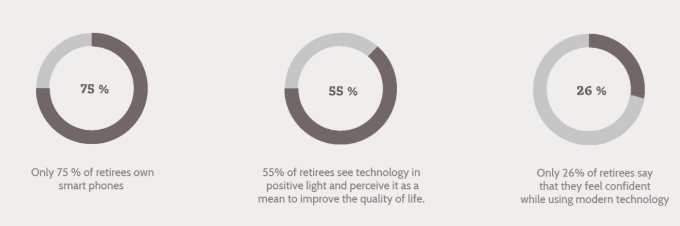
(Based on a survey conducted by Erasmusu in Bovisa, Milan 2015)
Project Brief & Brainstorming
Project Brief
Envision and design a way to build social impact using innovative yet traditional solutions to suffice the retiree's need for entertainment and communication to overcome their loneliness.
Brainstorming
In order to create a base idea for life-quality improving technology for retirees, brainwriting was used to write down and sketch as many ideas as possible, thereafter build on the thoughts. As a sum-up of the action, the ideas were themed into 9 following themes: money, shopping, health, transport, time management, safety, social, communication and entertainment. Lastly the focus was on the last three themes as it was clear from the beginning - the gap of technological knowledge makes retirees remote from society, leaving them bored and lonely.

Qualitative research
After having a rough primary overview of the field, the qualitative research was conducted at Da cri bar (tea bar) at Piazza Dergano, Bovisa, Milan on sunday at 1 pm, since it is well known place for retiree get togethers after sunday church.
To start with, semi-structured interviews were held, with a purpose to get insights straight from the retirees. Open-ended questions were asked, to provoke discussion about the matters. The topics of the interview reflected on participants' everyday life - habits, keeping in touch with friends, loneliness and technology.

Persona development

Pino Annoiato
“As I'm a retired man with not much to do, in the mornings I go to a nearby bar to take a cappuccino. After reading football news from the newspapers, I go to a park to pass time in the hopes that I would find a acquaintance to chat with.
Sometimes we start to talk about random things with other elderly sitting there.”
I want to stay active but...
My goals
I want to read football news at home in the morning.
I don't want to be a “boring old man” going around without a purpose.
I want to socialize and find people with similar interests.
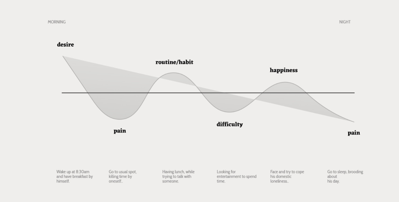
Empathy map
Ideation Process
The ideation process with the excercise of - “How might we”-give a chance to elderly to feel engaged in their local community - by sharing their knowledge, improving their self-worth and reducing loneliness?”.
Therefore, using How Might We method, provoked the members to find bunch of distinct innovative solutions.
Heading towards potential solution, a method called “Crazy 8's” was employed. It is an approach by Google and used in their Design Sprints. It entailed drawing eight diverse ideas in eight minutes. The results included ideas such as, totem for meet-ups to provide solutions to local problems, an app to launch events for elderly, a space where elderly share their knowledge, building an archive of memories etc.
In the final brainstorming session, a poster visualizing the final concept idea was created. A newspaper to explore the community, a device to identify local discussions, cross-channel device for meetups, an app for events and a news board merging physical and digital newspaper - were the ideas that got evaluated.

Ideation process : The Crazy 8 exercise.
Product attribute corresponding to user needs

low fidelity user interface mapping
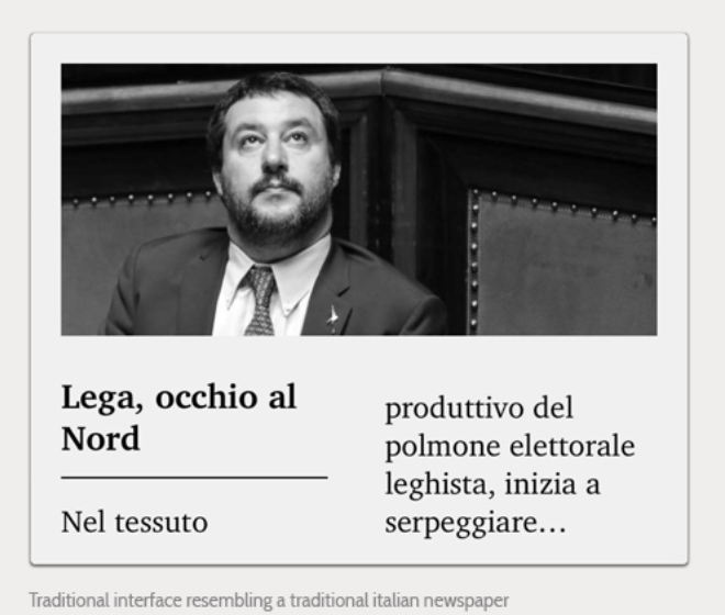
Traditional interface resembling a traditional italian newspaper
Design
The content is following a designed hierarchy, which helps the user to see the most important articles and connected actions, such as opening an article, saving it or continuing to the archive.
Since seniors are not used to tech vocabulary and shortcuts, it was critical to explain each action with specific words, for example “Save Article” was used instead of “Save”. Moving to the visual design, a serif typography, called Charter, was used and adapted for the digital screen. This typography is easily readable and designed with a strict purpose to not tire the eyes of the reader. The interface is in black and white - a choice related to the usage of e-ink technology, but also to follow the newspaper metaphor.
The interaction
Keeping an eye on both, physical and digital experience, the product was designed following usability standards with constant iteration based on the insights of user testing. The main two gestures in the product experience are as follows: tap for selecting and swipe for moving onward or backward. The user will be able to tap on all of grey-filled surface to open an article and to turn page swiping on every corner of the interface.
The prototype
The final digital prototype was designed using Adobe Flash. Replicating the sense of turning the pages of a real newspaper and opening selected articles. It is visualized on a tablet device to reproduce the right touchscreen interaction on the interface.
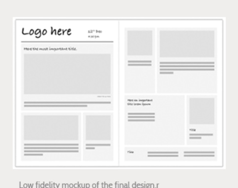
Low fidelity mockup of the final design
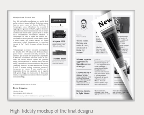
High fidelity mockup of the final design
final User interface prototype (high fidelity)
Finding an handy ability of Adobe Flash, the digital prototype was implemented with it. Giving the sense of actually turning the pages of a real newspaper and opening selected articles. It is visualized on a tablet device to reproduce the right touchscreen interaction on the interface.

Wireframes
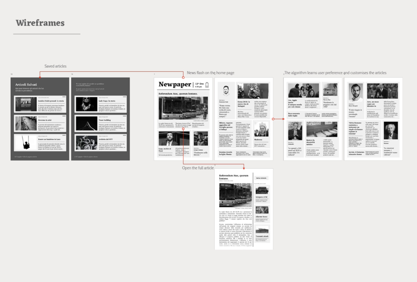
Newpaper - Virtual touch
How does the backend work?

Backend workflow map
Information flow
On the map above, the relation and the flow of information along the system are shown. At the extreme left, in the web, we find all the entities creating written content (news services, blogs, magazines) streamed in the form of news feed, standardized (e.g. atom feed).
At the extreme right, in the physical environment, Newpaper user is able to benefit from this content and read it from the product's interface.
In the middle, the product system made of the physical product owned from the user and the service infrastructure, is able to bridge the two extremes.
The database scrapes the net in search of news feed to collect, it organizes the articles based on categories found as metadata and finally sends the articles to the physical product in the hands of the user.
Meanwhile, every user's interaction with an article is registered, to create a user profile based on one's preferences. This profile will be used by a recommendation system algorithm to suggest to the database which are the most suitable articles for that specific user.
Atom feed information
Focusing on the news streams, each feed is made of information about the channel (for example, the New York Times politics channel) itself, and then information about each single article in the feed. Information needed about the channel: ID, Name, Last update, Publisher, Link, Category and Rights.
Information collected about each article: ID, Title, Last update, Author, Content, Link, Summary, Category, Published and Rights.
Some of this information is directly used in the interface to display important pieces of content to the user. Whereas, some is simply collected to be used by the system in order to make a model of the content, used by the recommendation algorithm.
Recommendation system
From all of aforementioned information, the most important is the category of the article, as it provides sufficient elements to the recommendation system.
The system adopted, is “content-based”, meaning that the algorithm suggests and filters articles based on 2 main elements:
1. The keywords (categories) of the articles - as dimensions to place the content in a vector space model.
2. A profile of the user preferences - is based on a history of the interactions with the articles and they are used to place the user in the same space model of the articles.

Content based filtering
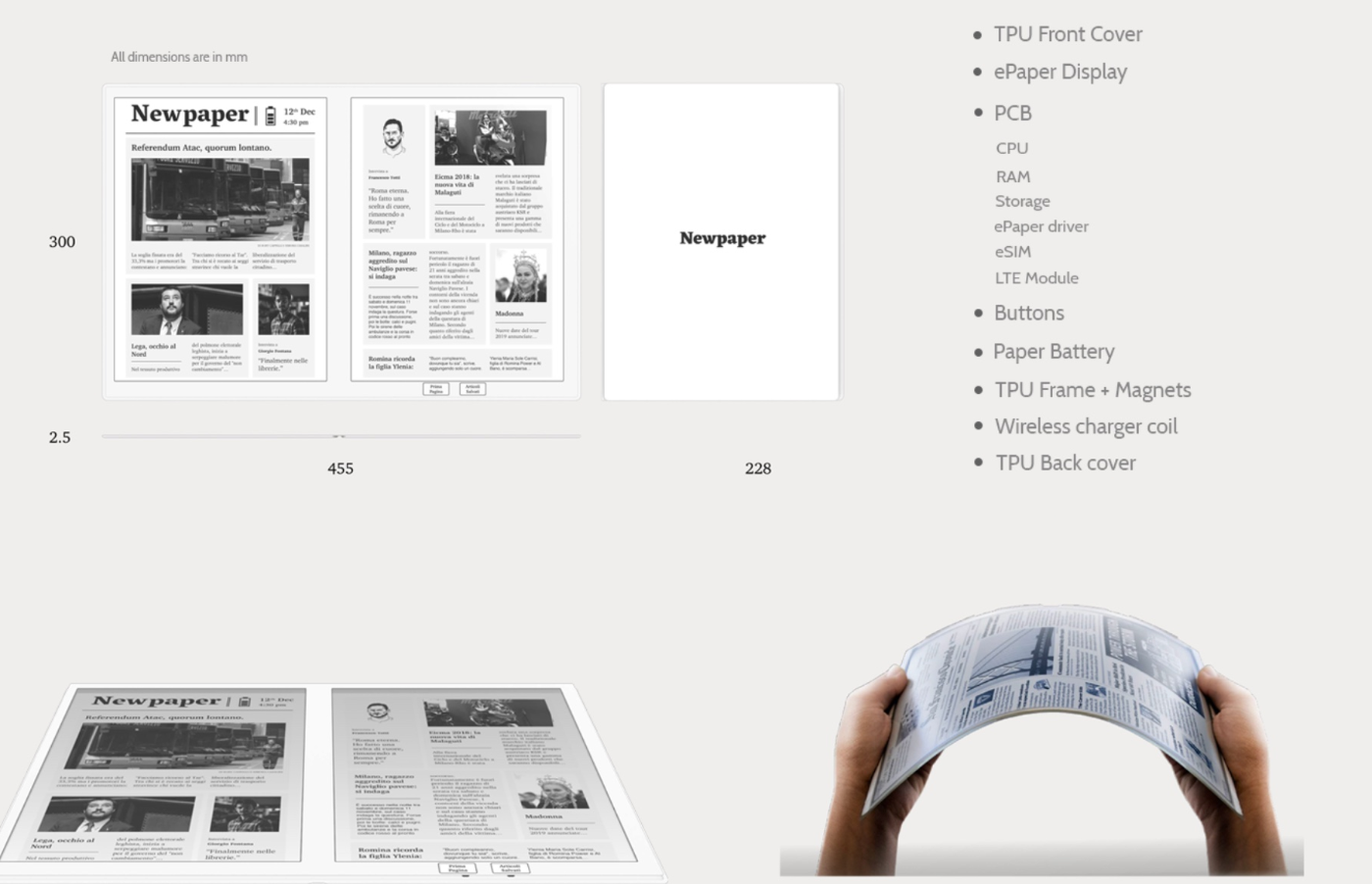
How does the tangible product work?
Newpaper - Digital Prototype interaction
User testing
How was the user testing conducted?
User Testing comprised of three main activities as follows :-
1. Conversation starters (Inspiration phase) - 4 different cards were given to the participants with the goal to boost the conversation and encourage creativity. Also, the aim was to understand how often they read their newspapers, how the newspapers have changed and what they like/dislike about that change.
2. Card sort (Inspiration phase) - 13 easily understandable word-and-image-cards were handed to the participants. Therefore, they included concrete primary sections (like politics and sports) as well as more abstract matters (like events and crosswords).
The participants were asked to rank them according to their preferences. The main goal of the activity was to understand the feature priority for the user for better navigation.
3. Co-creation/usability session (Ideation phase) -Interviewing with open ended questions and behaviour observation was the goal of this session.
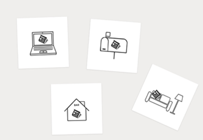
Conversation starters : Put a bunch of ideas in front of users to spark their reactions.
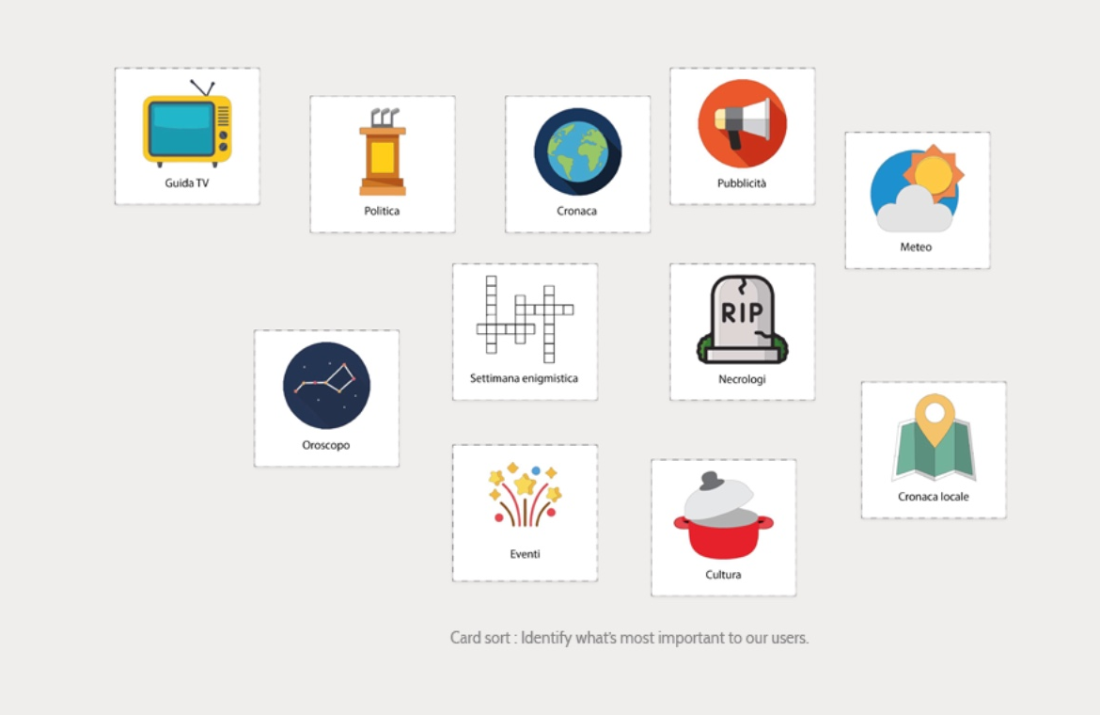
Card sort : Identify what's most important to our users.
User Testing : Insights from users
1. Retirees want to discuss the daily news with other people.
2. Testing showed that the product needs to make the meetups UI element more catchy.
3. One of the reasons elderly collect and archive the articles in real life, was to share them with people later.
4. It was intriguing to know that the retirees preferred the swipe action for turning the page rather than the physical action of turning the page.
5. Also, in terms of UI, it was seen that a simple button with “Save article” works the best - therefore, clear copy writing is important.
6. Dimension of the product played an important role for its desirability amoungst the retirees. Being able to carry the product along and access it in certain moments, was very important for all participants.

High fidelity Augmented reality (AR) prototype
Toolkit
Augmented reality was used for the final prototype, since E ink technology was very expensive for prototyping. Unity game engine was used together with built-in AR plugin, called Vuforia.
AR apps are powerful means for showing different perceptions of the surrounding world. Although, they come with a clear drawback: there is no direct interaction with the object, but only via the screen of the device. Normally the AR image covers the real environment, so if the user tries to touch it, the hand disappears under it.

AR Camera : AR covering the human hand
Solution
To find a solution for the problem, two virtual cameras inside Unity were used. It was possible to record the real environment and the augmented image in two different layers. Thus, render them in the opposite order through sorting them in ordered layers.
This solution seemed to be working, but then a problem occurred: the augmented image was not visible because the Camera was covering the other render.
Therefore, to finalize the result, a green screen effect was applied on the hands plane. In this way, it was actually possible to place the hand over the augmented image.
Marker
To display the augmented image, Vuforia needs to recognize a marker, a target image. It has to be as asymmetrical as possible (e.g. no circles).
The current marker has been used in yellow and green colors to apply a custom shader to the plane rendered by the Camera. The team achieved a Chromakey/Green screen effect that allows the user to see the hand on the augmented image.
Buttons
Virtual Button is a feature that allows to interact with the target image and then with the augmented image. The more detail the target image has, the easier for the camera it is to detect the virtual button and target specific events.

Marker
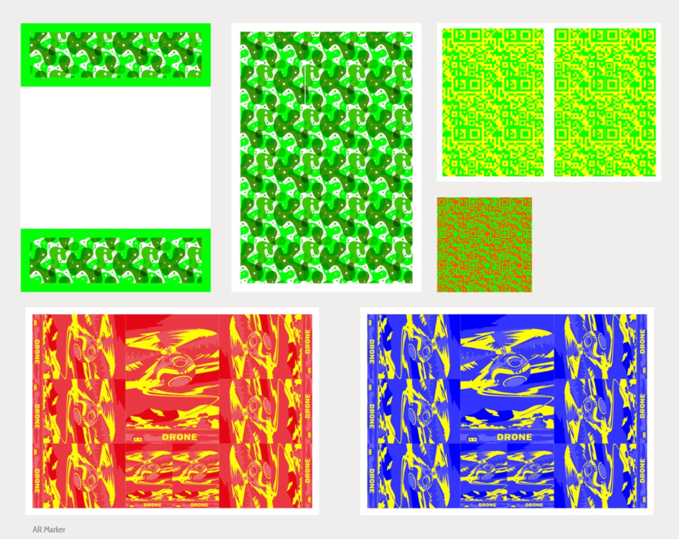
All Markers

Virtual Button
From Augmented Reality to Mixed Reality
Finally, to achieve authenticity, binocular stereo view was used. In order to accomplish, digital eyewear setup was needed in Vuforia Configuration panel. Also, the SDK for the augmented reality that was intended to use.
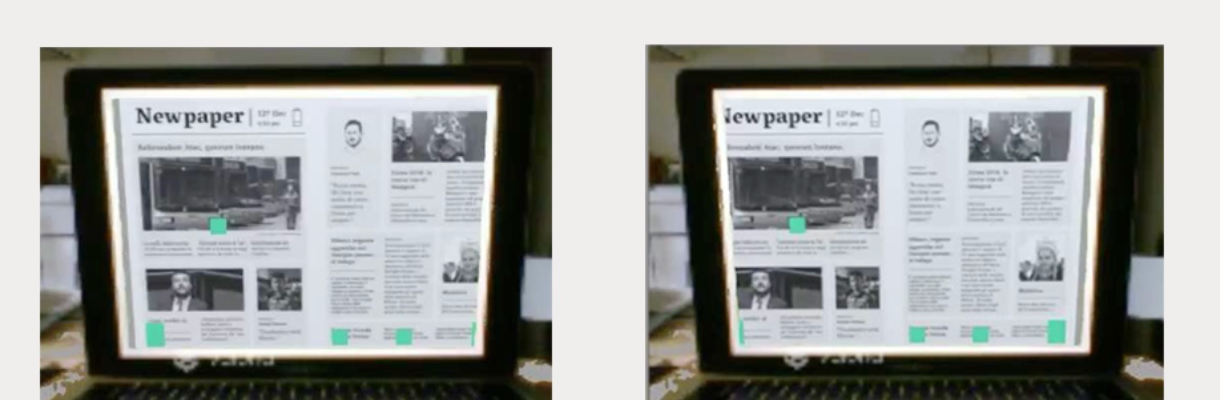
Binocular stereo view