PwC

Together Anywhere Connect App

“I can work from any PwC office in the world. What I need is a place to stay, someone to take my own place while I am away, and a bit of help settling in.”
PwC employee
Case study Native mobile and web · Employee mobility

A native app helping people live and work abroad, a solution to the global phenomena of the great resignation during covid 2022.

Project brief

Designing a native mobile and web-based app for PwC Global which enables and facilitates PwC’s together anywhere program, as a solution to combat the attrition rate and the great resignation.

Client type

PwC, top four global consultancy firms / Fortune 500

My role
Conducting workshopsJourney mappingAgile / scrum sprint planning, DevOpsEmpathy mappingSprint prioritisation and retrospectivesProduct attribute chartProduct roadmap and release train planningIdeation and sketchingStakeholder managementUser flows and wireframesUser research and analysisLow-fi and hi-fi prototypesSystem analysisUAT (user acceptance testing)Requirement mappingUsability testingUse casesQA collaboration and bug testingExtensive user interviewsMaterial design / pattern libraryPersona buildingSpec mapStoryboarding
300+
listings within the first month of the national launch, at an average session length of seven minutes
$5M
funding secured, with releases planned for New Zealand, Canada, the US and the UK

The process

1.1 Design process, my approach
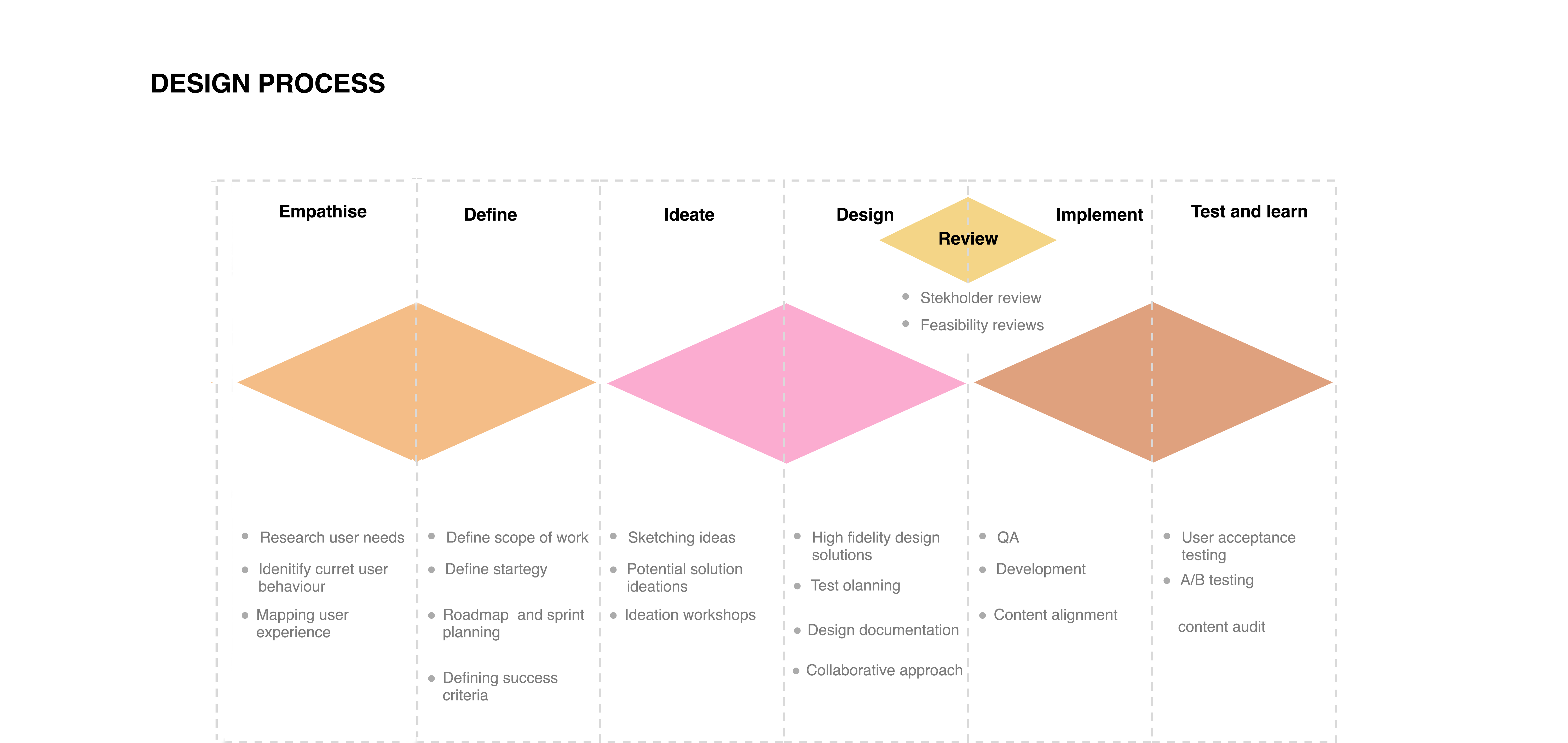
Design process
I

Research phase

User research and analysis

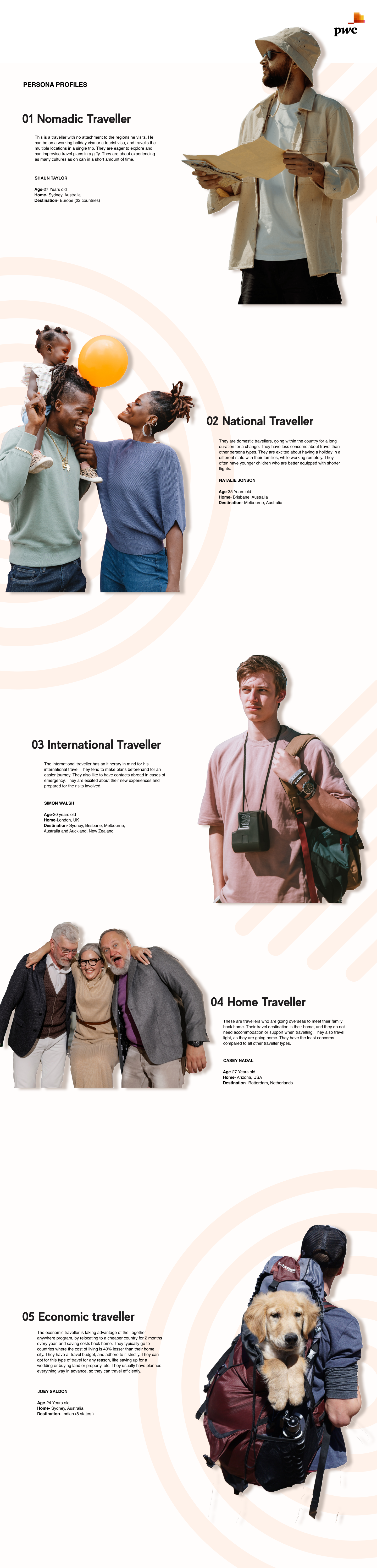
The first step was to research about the policies determined in the together anywhere program which enables any PwC employee to live and work from anywhere in the world for a period of 8 week in a year. The first step was to map out the different types of personas that could use the program for its different intended purposes.

There was research about the company global policy which highlighted key constraints for the user group. The next stage was to conduct workshops to understand user needs in mural and conduct in-person interviews with users from different demographic groups.

The data revealed 8 personas with different needs for the application, of which there were three primary personas which comprised of to 70% of the users. Based on persona, there were user journey maps designed in mural, mapping out touch points, pain points and special needs of each group.

Discovery workshops

Four remote workshops in Mural with mobility, tax, risk and the product team, run as timed sections with a stated outcome each. They took the programme from a written policy to a set of opportunity statements the squad could design against.

Goals & objectives · 20 mins
Review the goals below and add any long or short term goals you think could be valuable.
Section outcome: a shared list the squad can design against
Understand
Complete before session
Business goal
Cut regretted attrition by giving the workforce a reason to stay that competitors cannot copy. Together Anywhere is the flagship benefit of the flexibility strategy, adoption is the measure.
Programme goal
Take the eight-week policy from a PDF on the intranet to a product people actually use, with hosting, tax and visa guidance answered inside the flow.
Employee goal
Let me find a colleague’s home in the country I want to work from, understand what I am entitled to, and request it in one sitting.
I have the secondment but no idea where to start
Hosting has to feel safe before anyone lists a room
Trust is the product
Tax questions kill the idea at the first hurdle
One global experience, local rules underneath
Directory chat is already doing this badly
Hosts want to pick their dates
Make the policy readable
Managers need visibility, not approval theatre
Launch nationally, then four more markets
Goals & objectives
Current state · 20 mins
Review how the programme works today, plus the products people already use for this.
Section outcome: a shared list the squad can design against
Understand
Complete before session
Intranet policy page
A two year secondment, subject to local tax review and partner approval.
Refer to the country annex..
Mobility request form
Twelve fields, no save, emailed as a PDF to a shared inbox.
Average turnaround eleven days..
Directory chat
People ask in the office channel whether anyone has a spare room.
No record, no verification..
Country annex
Tax residency thresholds per market.
Written for the mobility team, not for staff..
Airbnb
Studied for listing structure, trust signals and how requests are confirmed.
Gumtree
Studied for listing structure, trust signals and how requests are confirmed.
Facebook marketplace
Studied for listing structure, trust signals and how requests are confirmed.
Housemate
Studied for listing structure, trust signals and how requests are confirmed.
Meetup
Studied for listing structure, trust signals and how requests are confirmed.
Amazon marketplace
Studied for listing structure, trust signals and how requests are confirmed.
Doing well
Policy is genuinely generous
Staff already trust each other
Verification data exists in HR
Strong appetite in every office
Leadership sponsorship secured
Local partners want to host
Could do better
No way to find a host
Eleven day turnaround
Tax guidance unreadable
Nothing on mobile
No record of past stays
Hosts have no controls
Current state analysis
Opportunity statements · 20 mins
Using the findings, write a how-might-we statement for each insight you own.
Section outcome: a shared list the squad can design against
Understand
Complete before session
Insight / learning
How might we
Doing word
User
User need
Outcome
Customer impact
People have the secondment but no starting point
how might we
guide
a first-time traveller
to a country and a host
so that they book their first stay
and use the benefit they were given
Hosts will not list without control
how might we
allow
a host
to set dates and house rules
so that they feel safe listing
and supply grows in every office
Tax and visa questions stop people cold
how might we
answer
any employee
the policy question in context
so that they stop leaving the flow
and requests are completed
Trust comes from the firm, not reviews
how might we
show
a guest and a host
verified staff identity
so that a stranger reads as a colleague
and requests are accepted faster
Requests disappear into inboxes
how might we
remind
both sides
where the request has got to
so that nothing stalls silently
and turnaround drops from days to hours
Opportunity statements
Ideation · 30 mins
Sketch whatever you are comfortable drawing against your how-might-we, then a second round.
Section outcome: a shared list the squad can design against
Understand
Complete before session
HMW · Round 1
Guided request, one question per screen
Progress marker on every step
Policy answered inline
Confirmation states response time
Start with dates, not places
One question per screen
Policy answer sits under the field
Show entitlement left, in weeks
Save and come back later
Confirm screen states response time
HMW · Round 1
Map-first browse
Dates discovered too late
Filters buried
Good for open-ended trips
Host sets available weeks first
House rules as chips, not prose
Badge appears only after HR check
Suggest hosts in your own practice
Shared projects shown as trust cue
Opt out of being discoverable
Country picker pinned to the top
Tax threshold in plain English
Escalate to mobility in one tap
HMW · Round 1
Host listing set-up
Calendar first, photos second
House rules as chips
Verification badge on publish
Requested, accepted, arriving, staying
Both sides see the same state
Nudge after 48 hours of silence
Start with dates, not places
One question per screen
Policy answer sits under the field
HMW · Round 2
Colleague match
Suggests hosts in your practice
Shared projects as a trust cue
Opt-out for privacy
Show entitlement left, in weeks
Save and come back later
Confirm screen states response time
Host sets available weeks first
House rules as chips, not prose
Badge appears only after HR check
Suggest hosts in your own practice
Shared projects shown as trust cue
Opt out of being discoverable
HMW · Round 2
Policy companion
Country picker at the top
Tax threshold in plain English
Escalate to mobility team
Country picker pinned to the top
Tax threshold in plain English
Escalate to mobility in one tap
Requested, accepted, arriving, staying
Both sides see the same state
Nudge after 48 hours of silence
HMW · Round 2
Stay timeline
Requested, accepted, arriving, staying
Both parties see the same state
Nudges on stalled requests
Start with dates, not places
One question per screen
Policy answer sits under the field
Show entitlement left, in weeks
Save and come back later
Confirm screen states response time
Host sets available weeks first
House rules as chips, not prose
Badge appears only after HR check
Ideation
1.2 Discovery workshop boards, Mural

Discovery interviews

Twenty-four PwC employees across five offices, recruited to span the demographic split of the workforce rather than the people most likely to volunteer.

What we asked
  • What stops people applying for a secondment at all
  • How a host decides to open their home to a colleague
  • Which parts of the policy are read, misread or ignored
  • What trust looks like between two strangers at the same firm
  • Where the current process already breaks down
Key learnings
  • Eight personas emerged, three of them accounted for 70% of the user base
  • Uncertainty, not cost, was the main blocker, people did not know where to begin
  • The internal directory was already doing this job badly over chat and email
  • Hosts wanted control over dates and house rules before they would list at all
  • Tax and visa questions surfaced in every single interview

Synthesised in Mural into journey maps and empathy maps per persona, which became the input to requirement mapping.

Mural · Interview synthesis
Primary personas, 70% of users
The homesick traveller
Works from a relative’s country for part of the year. Needs the policy read for them.
The relocating starter
New to a city, no network, needs a landing pad and colleagues on arrival.
The host
Has a spare room and wants the firm, not a stranger, to vouch for the guest.
Quote
“I have the two years available. I have never once applied.”
Quote
“I would host, but I want to say which weeks and who.”
Question
Where does a person actually start, the policy, or the place?
Question
What makes a colleague’s home feel safer than a rental?
Outcome
Verification by staff ID is the trust mechanism. Reviews come second.
Outcome
Policy has to be answered inside the flow, not linked out to intranet.
1.3 Interview synthesis and primary personas
II

Planning phase

Roadmap and agile sprint planning

Based on this data, the sprint plan and product roadmap was created in collaboration with the product owner, business analyst and product manager. Azure dev ops was used for project management for Together Anywhere app, and 2 weeks sprints (with daily stand ups), product backlog, and roadmap was mapped for the 6 months.

I conducted feature prioritization sessions, sprint retros, and managed bug fixes along with the QA that took place during the project.
Agile sprint plan and product roadmap
1.4 Product roadmap and agile sprint plan
III

Defining phase

Requirement mapping

After the user interviews and understanding their frustrations, the requirement criteria was created along with the functional use cases. Next step was to design a list of features for the backlog and conduct prioritization session, design a spec map which was a join collaboration between the BA and the design lead (me).

The user flows, and ideal journey maps were created for the possible travel of the users. This is also when similar products were studied like Airbnb, Gumtree, Amazon marketplace, Facebook marketplace, housemate.com, and meet up, as the product was a combination of them.
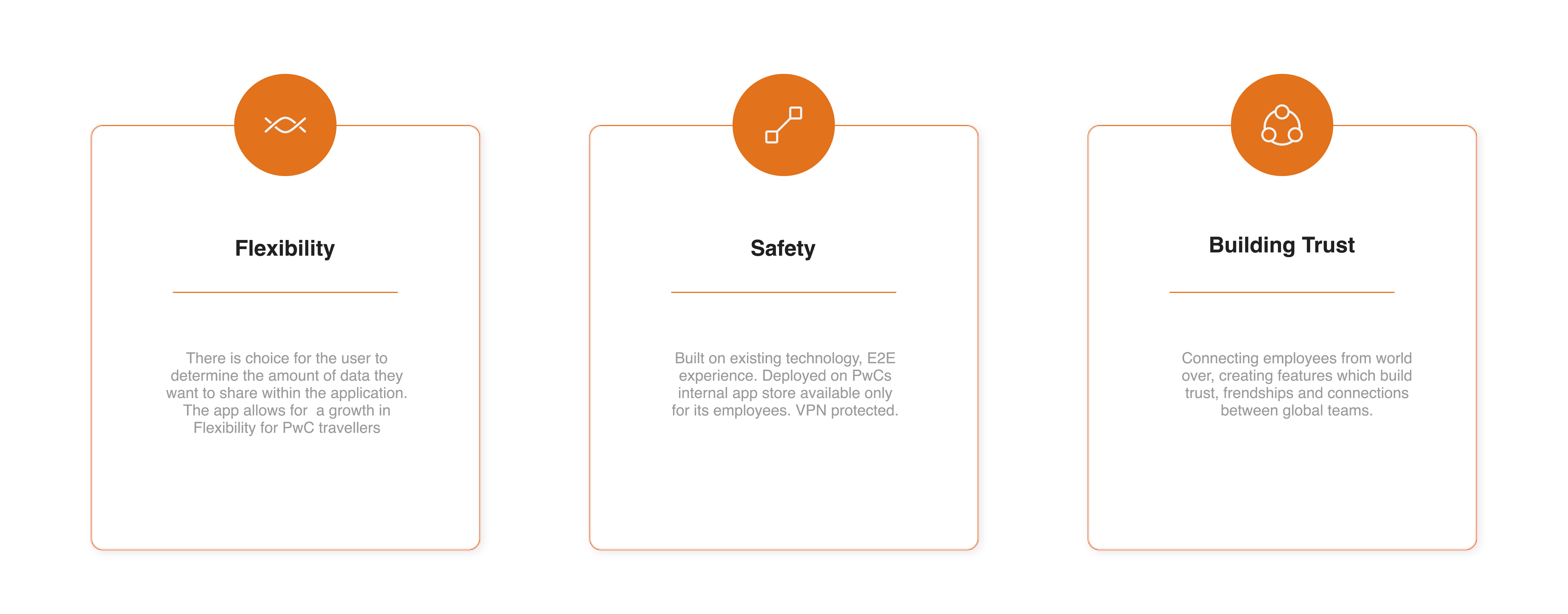
Three key aspects of user engagement
1.5 Key aspects of user engagement
IV

Ideation phase

Ideation, information architecture and card sorting

The next stage was ideation, where in multiple versions of low-fi ideas and information architecture was mapped on paper and shortlisted based on the card sorting method for feature prioritization. Wireframes were then created in Figma after which the material design was created using atomic design principles in Figma. Next using components and assets, I created a final Figma prototype for release 1, which was set off for development.

Story mapping
1.6 Story mapping
V

Design system

An atomic library built for two platforms and every user

Together Anywhere ships as a native iOS and Android app and a web app, built by two development squads. A shared system was the only way to keep one product voice across three codebases, so I built it in Figma on atomic design principles, tokens, then atoms, then molecules, then screen templates, mapped one-to-one onto Material components so Android inherited platform behaviour for free and iOS only needed the deltas.

Accessibility was written into the system rather than audited at the end. Every token, component and state below carries its own WCAG 2.1 AA acceptance criteria, so a developer picking a component out of the library gets the accessible version by default and QA has something objective to test against.

1.7 Colour tokens and measured contrast

PwC's brand palette is warm and high-chroma, which is exactly the palette most likely to fail on contrast. I measured every pairing and gave each colour a rule about where it is allowed to appear, rather than leaving it to judgement.

Orange 500 · #D04A02
4.53:1 on white, AA for body text, primary actions and brand fields
Orange 700 · #A83B02
6.40:1, the pressed state, and the only orange allowed for links inside body copy
Yellow 400 · #FFB600
1.77:1 on white, fill only, never type. Carries ink at 9.4:1 for status and highlights
Ink 900 · #201E1D
16.7:1, all body copy. Secondary ink stops at 4.6:1 and is never used below 15px

Colour is never the only signal: availability, verification and booking status each pair their swatch with an icon and a written label, so the states survive both greyscale and the eight percent of male users with colour vision deficiency.

1.8 Type scale

A six-step scale on a 4pt baseline. Body sits at 16pt so it never falls under the 16px minimum, and every text style is declared in relative units so the app reflows correctly at the 200% dynamic-type setting without truncation or overlap.

Display34 / 40 · 800
Headline25 / 32 · 800
Title20 / 28 · 700
Body16 / 24 · 400
Caption14 / 20 · 400
Overline12 / 16 · 800
1.9 Touch targets and spacing

An 8pt spacing scale, and a hard rule that every interactive element owns a 48 × 48pt hit area even when it draws smaller. Listing cards were the worst offender in testing, favourite, share and message all sat inside a 32pt row until this rule pushed them apart.

24pt icon, 48pt target, 8pt minimum between neighbours
Component states

Each component in the library ships with all six states drawn and specified, default, hover, focus, pressed, disabled and error, so focus is never left to the browser or the platform default.

Default Pressed Focus Disabled
1.10 Accessibility criteria built into the library

The app is used by PwC staff worldwide, including colleagues who rely on screen readers, larger text and switch control. These were the acceptance criteria attached to the component library, tested in UAT on VoiceOver and TalkBack alongside the sighted focus groups.

Every image and icon carries a purpose-written label
Listing photos describe the space, not the file. Decorative marks are hidden from the accessibility tree entirely.
Logical heading and focus order on every screen
Annotated on the handoff frames, so the reading order was a spec line rather than an accident of layout.
Forms label their fields and speak their errors
Persistent labels rather than placeholders, errors written in plain language, announced on the live region and paired with an icon.
Reduced motion honoured
Map and card transitions fall back to a cross-fade when the system preference is set, nothing auto-plays or parallaxes.
Text scales to 200% without loss of content
Cards grow vertically, no fixed heights, no truncation of names, dates or prices at any dynamic-type setting.
Nothing is gesture-only
Swipe-to-save and swipe-to-dismiss each have a visible button equivalent for switch and voice control users.
Language written for a global, multilingual audience
Plain English at roughly a grade-eight reading level, no idiom, dates and currency localised per market.
Tested with assistive technology in UAT
Screen-reader passes ran on the same four iOS and four Android devices as the sighted sessions, and the findings went into the same bug log.

Low-fi prototype

Drawn in greyscale so the testing sessions judged the flow and the words rather than the styling. Both primary journeys got a flow of their own, laid out from the card sort and the journey map, and reviewed against Nielsen’s heuristics and WCAG 2.0 AA before it went into the prototype.

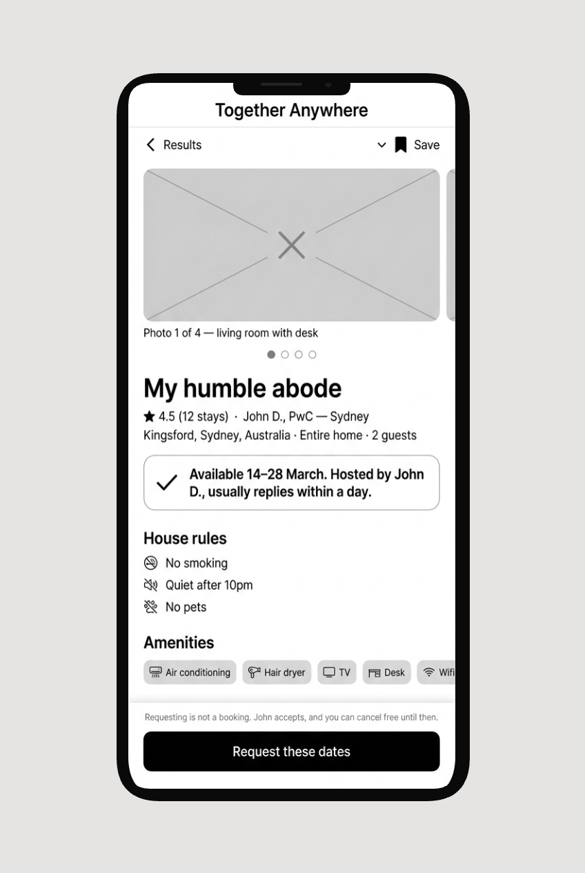
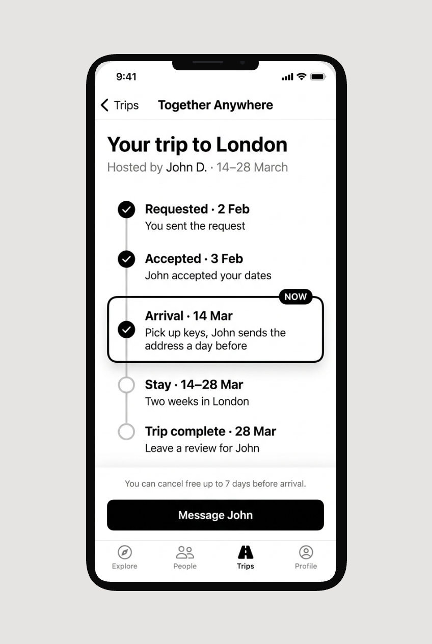
Navigation settled as explore, people, trips and profile. Listings moved under profile once the card sort showed people read the word as “places I can stay”, not “places I have listed”.

Journey one, finding and requesting a stay
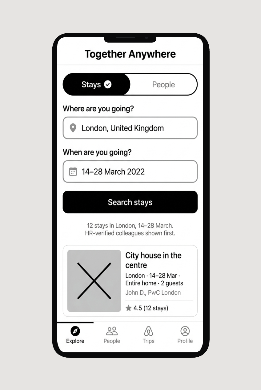
Explore. Stays and people are the first choice, not a filter
Stay detail. Title, trust and availability before amenities
Dates. Entitlement in plain words, states never colour alone
Request sent. The system says what happened and what is next
Trip status. A dated timeline, current stage marked in words
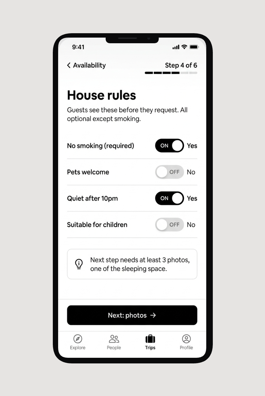
Journey two, hosting a colleague
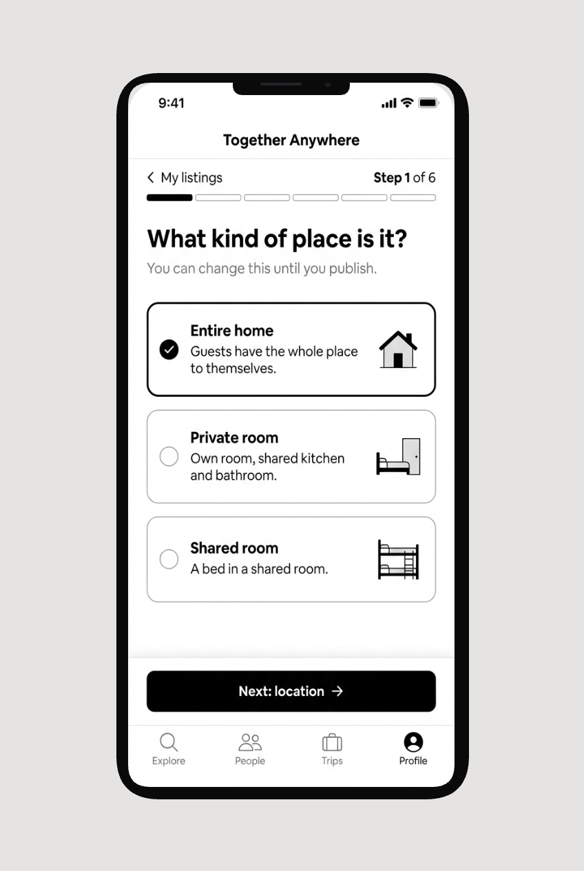
My listings. Live, draft and requests in one place
Create, step 1 of 6. One decision per step
Create, step 4 of 6. Switches with words, required marked
Create, step 6 of 6. Review everything, then publish
Steps kept visible, so nothing is lost going back
1.11 Low-fi prototype, native mobile app
VI

Delivery phase

Development, UAT and bug fixes

There was a very close collaboration between me and the dev team, and we had our own Dev design sessions daily in addition to the team stand ups, there was a user acceptance test that was scheduled for 3 focus groups from the top three personas, each comprising of 8 people.

The user acceptance test was done on four iOS and four android devices, and the experience of the users were recorded using a screen recorder. The test users later had to report on glitches, functionality and UI elements and their navigation through a carefully designed questionnaire form.

The findings of the UAT were logged as bugs in the query logs. There was also a special Bug prioritization session which led to improvisations in the release planning and roadmaps, based on the capabilities of the dev team to deliver in time.

High fidelity wireframes

The same two journeys taken to high fidelity on the component library, then reflowed for the web app so a host can manage a listing from a laptop and a traveller can browse on a phone.

Responsive web
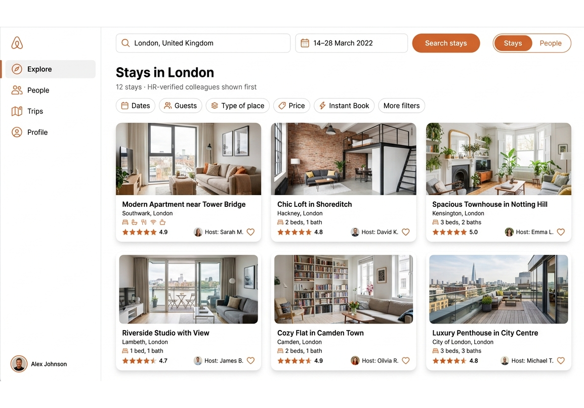
Web app, stays in London
Web app, my listings
1.13 Responsive web app, same components
Final UI mock ups
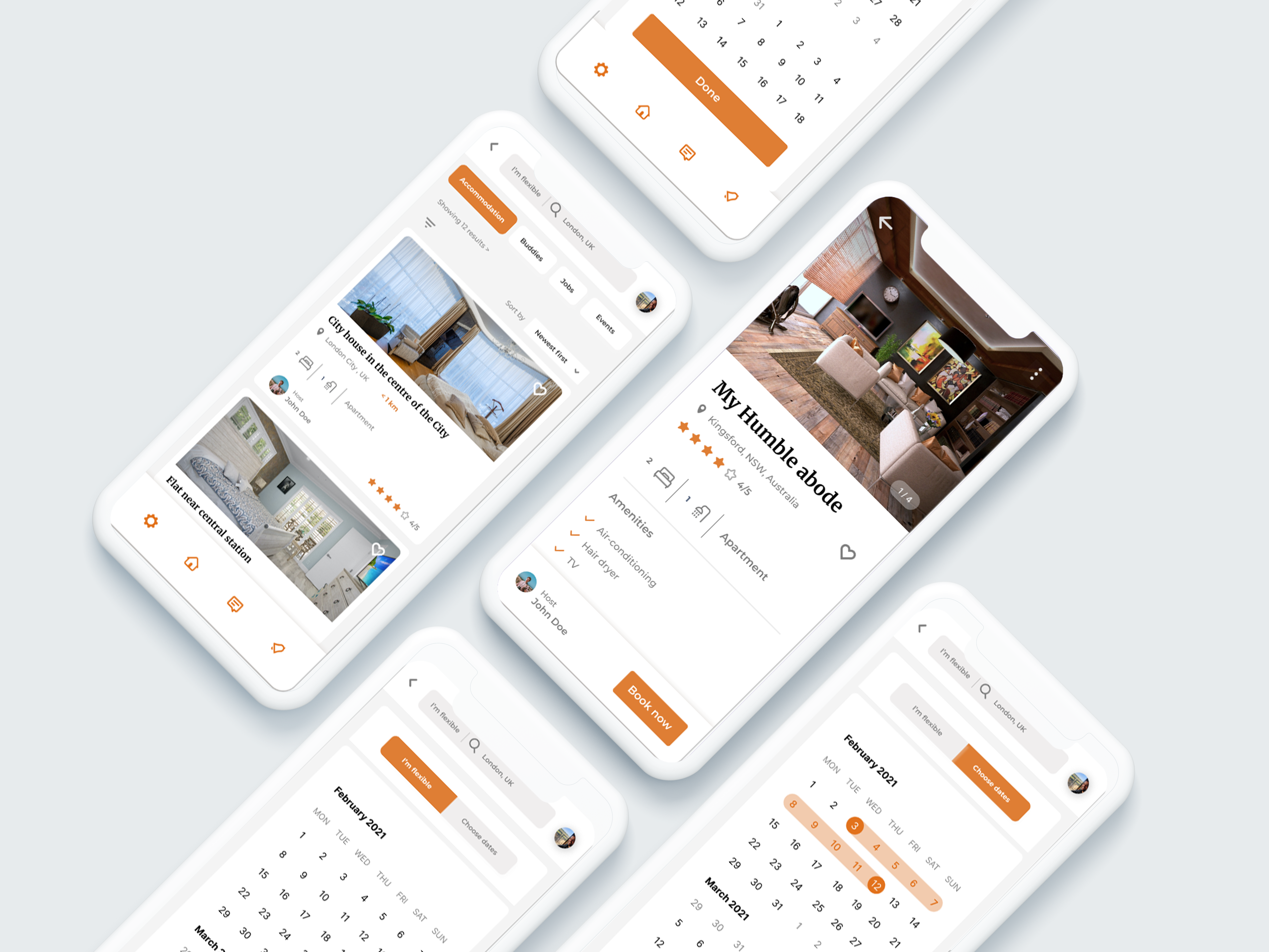
1.14 Final UI mock ups, native mobile app
Result

Operational in 136 PwC locations, with 364,000 users worldwide.

The native app is now operational in 136 PwC locations and reaches 364,000 employees worldwide. It launched nationally first, taking over 300 listings in its first month with an average session length of 7 minutes.

It was first rolled out in 2022 on a $5M budget, launching across New Zealand, Australia, Canada, the US and the UK.

© 2026 Vasavi Sadhu